mulberry paper, acrylic-based ink, wood and metal type, rubber stamp

Exploration
Here I've tested if my idea was possible. All text that you see is using Latin letters and numbers. It is legible to someone who is literate in Korean, with minor kerning and letter length issues.
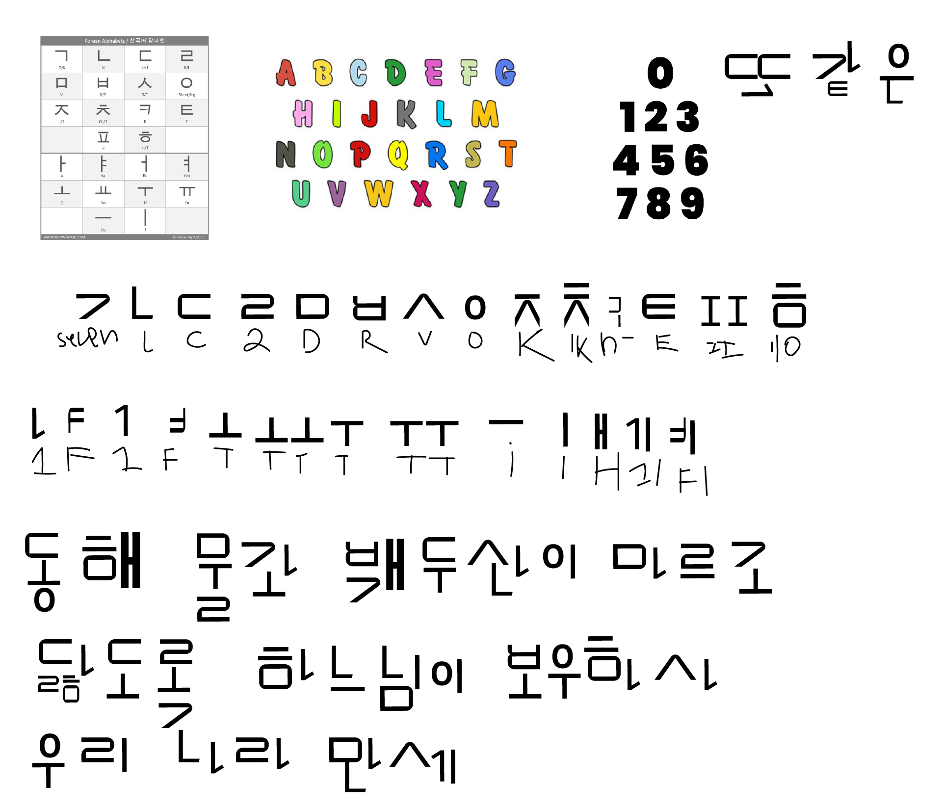
Here I first used Illustrator because it is quicker. The sample sentence on the bottom is Korea's national anthem. This was accomplished purely using Latin letters and numbers, without punctuation.

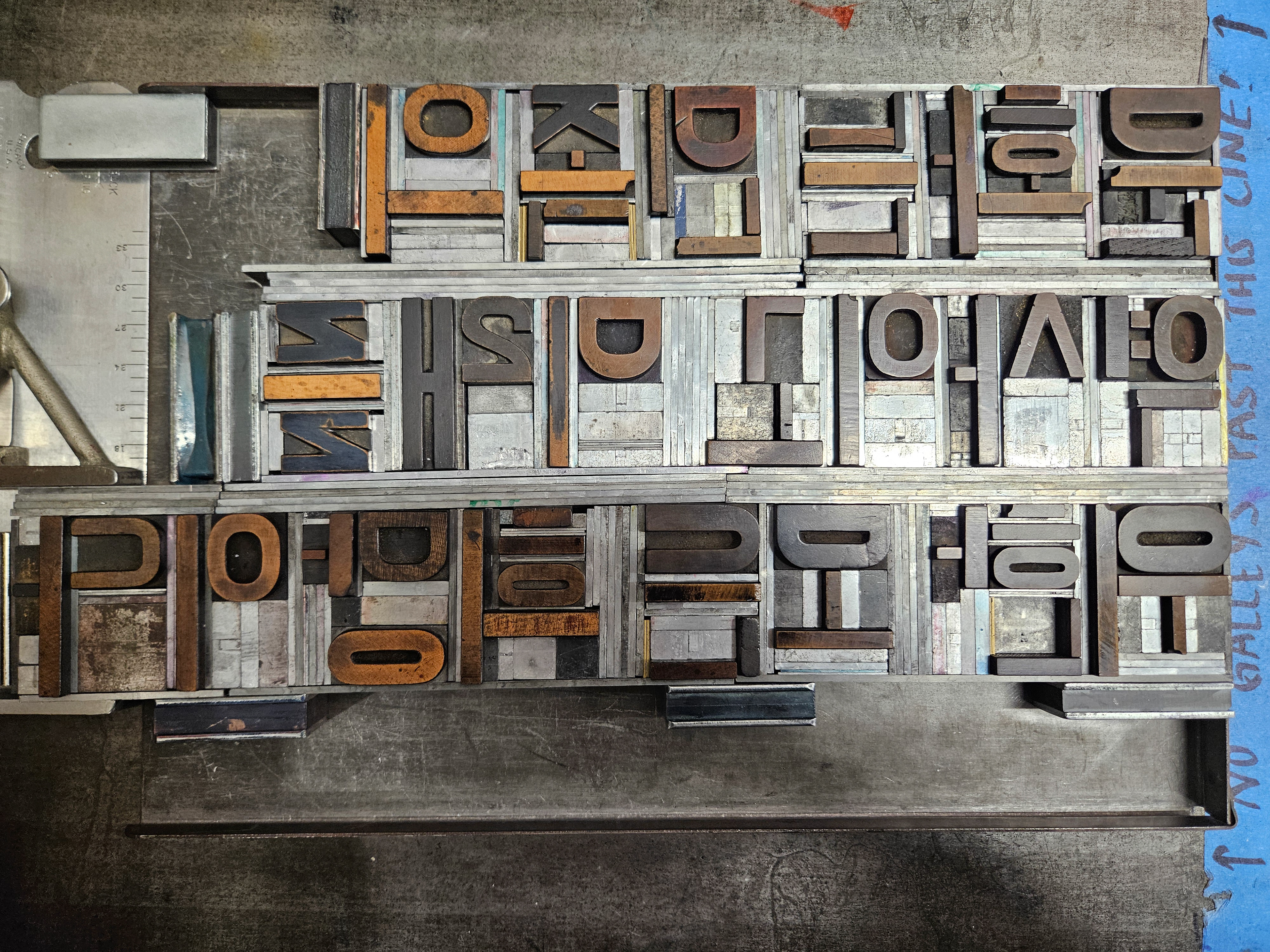
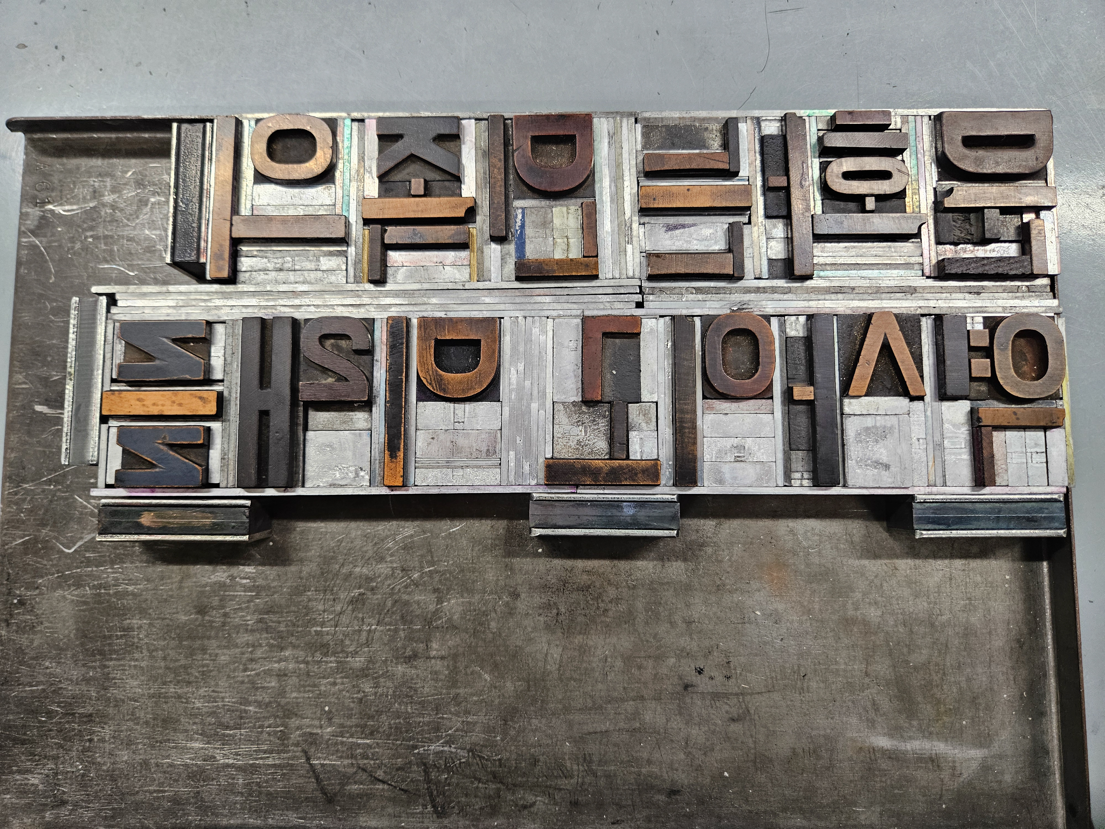
Wood type on galley

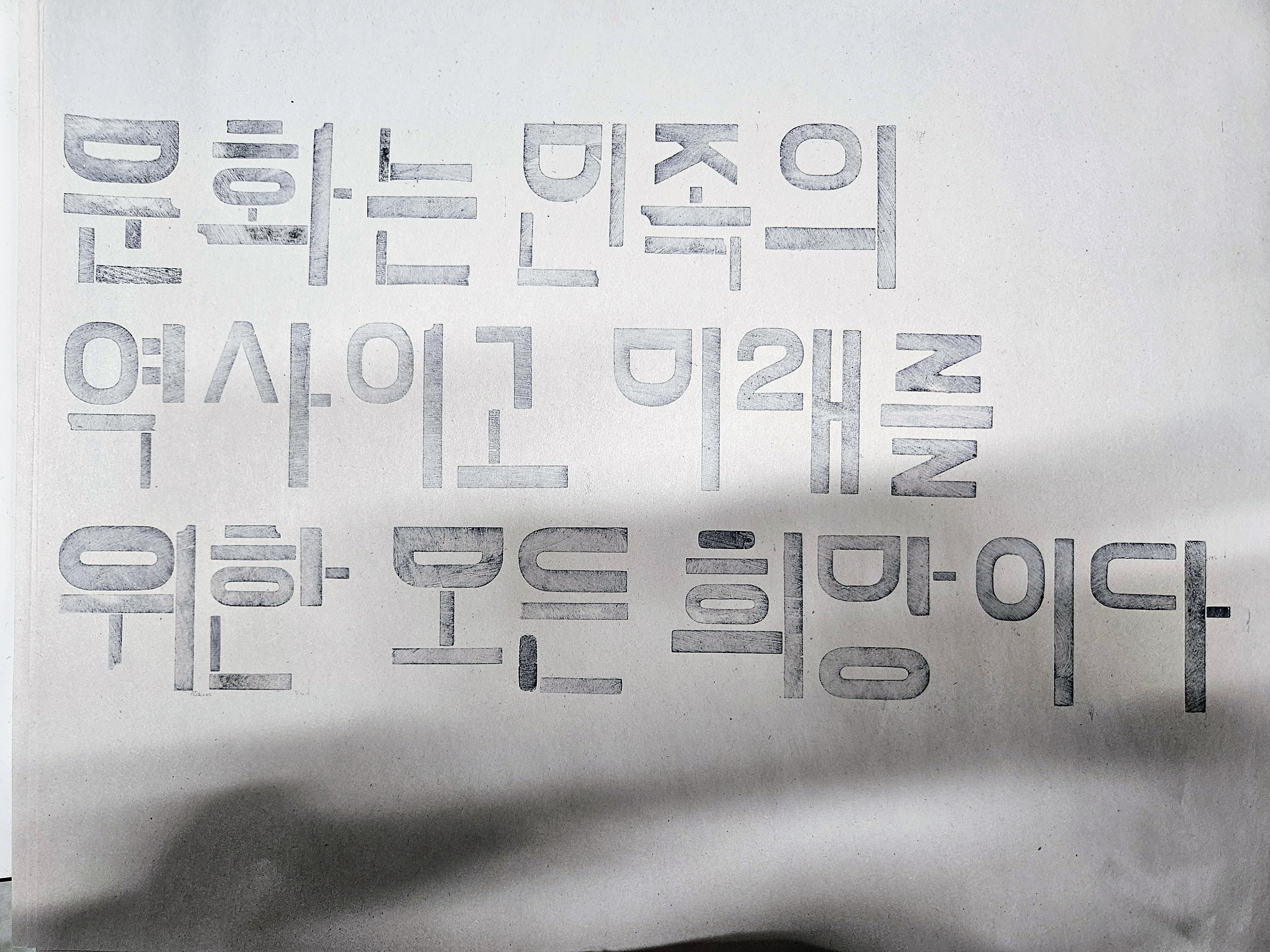
Test Print
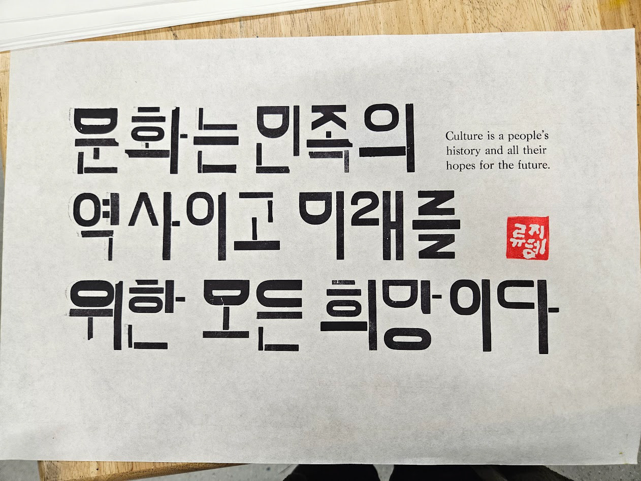
Pronounced "hangul", the name of the Korean written alphabet
Through exploration, I realized that I didn't know much about Korean typography or how to kern each character because I struggled with the spacing on the galley and it didn't look right on the test print either.

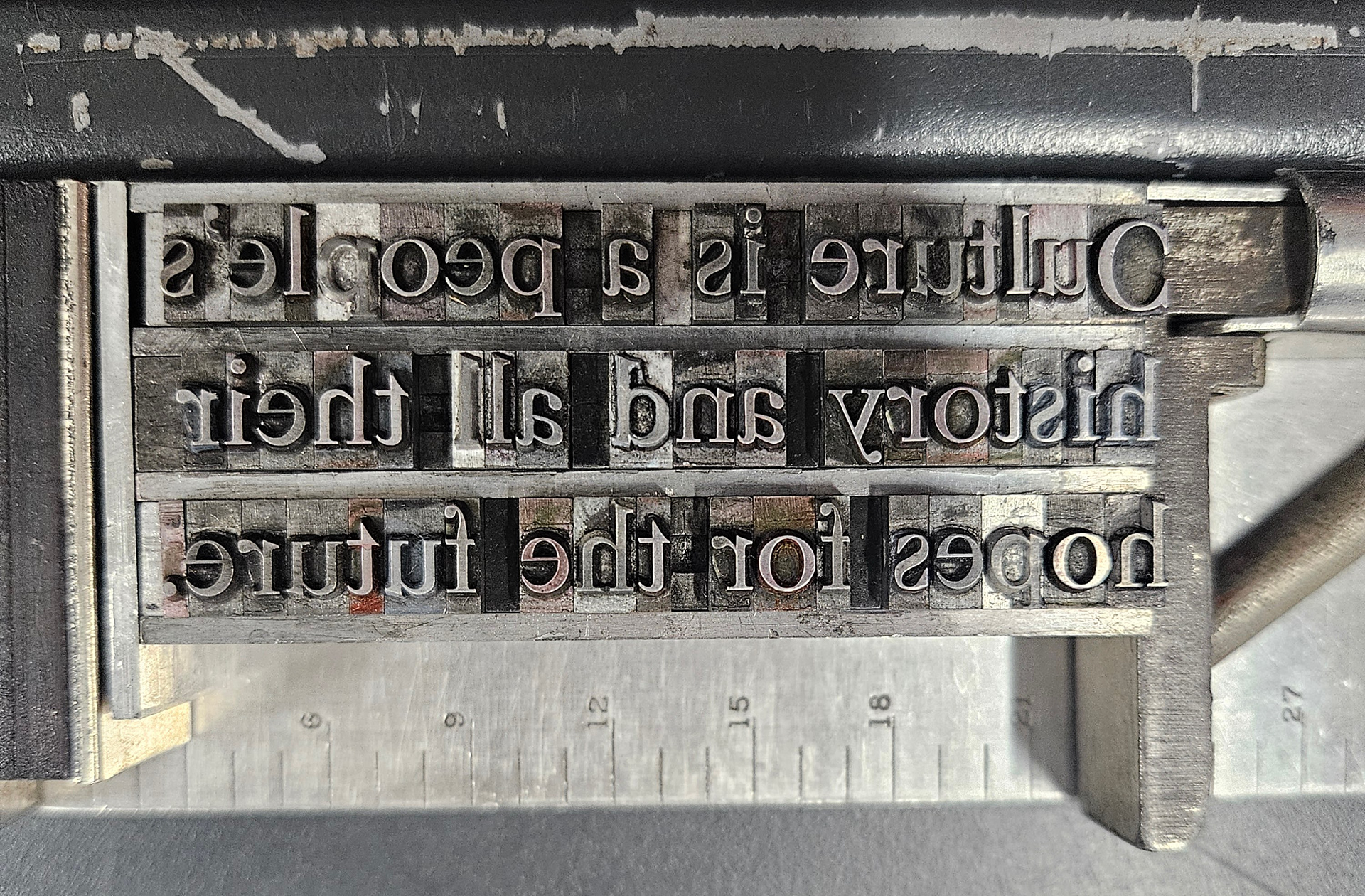
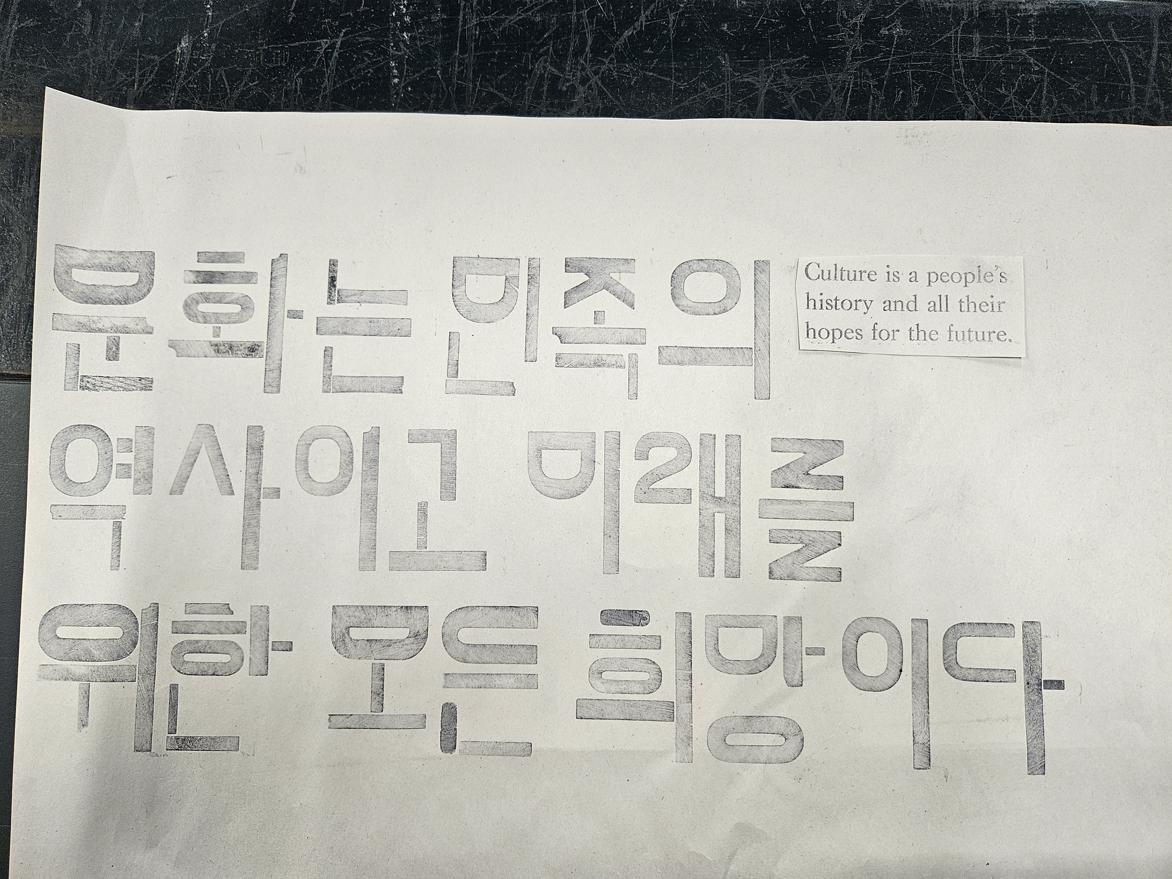
At this point, I decided on a quote that I've found on the internet about culture, since this piece is about the fusion of cultures/languages. Here I used lines to help me visualize where each single letterform was in relation to its counterparts.
Things I've noticed:
All the letterforms in a single character vary in size depending on the amount of letterforms or even the amount of space it needs to take up in one character. (observe the square shaped letterform in each of the characters it is being used in)
Balance in each character is key. No letterform is too overbearing or taking too little space. Lining letterforms together right and proportionally achieves this, as well as making each character look cohesive.
Trial and error

Limitations
There was a limited amount of wood type that had the characteristics that I was looking for, especially punctuation, which provided inconsistencies in line thickness and length in similar letterforms throughout.
Korean kerning and Latin letter kerning are entirely different which led to some spacing issues. Placing punctuation and letters next to other letters that were meant to have natural Latin kerning led to unwanted spacing.
Final Touch
To make this piece feel more authentic and more personal, I carved my Korean name, 류지혜 into a rubber stamp. This is a practice that was done traditionally and is still being practiced now in place of a signature.